Projects · Full case studies

Five projects.
Five systems of their own.

Each case brings together everything that builds the project: strategy, identity, applications, and the web experience where it exists. The brand and the interface read as one, as parts of the same system.

Case 01 · Identity · Website · AI

Moran &
Associates

A professional practice spanning medicine, data, and software needed an identity that could express rigor without turning cold, and a digital experience that could make its complexity visible.

Website · Interactive professional atlas
The challenge

Bringing different disciplines together under one voice.

The starting point wasn’t designing an isolated symbol, but finding a structure that could bring very different fields together without diluting Tomás’s personality. The brand had to convey precision, judgment, and a deeply human way of connecting knowledge.

The idea

An identity understood as a map.

The idea of an atlas turned the career into connected territory. From there came a modular composition, a clear editorial hierarchy, and a graphic language that shows relationships instead of presenting services as separate compartments.

The decisions

Technical rhythm, contrast, and room to breathe.

Typography carries the authority; the grid brings method, and the bright accents bring warmth. Every element has a specific function and can scale from a minimal signature to a complex digital experience.
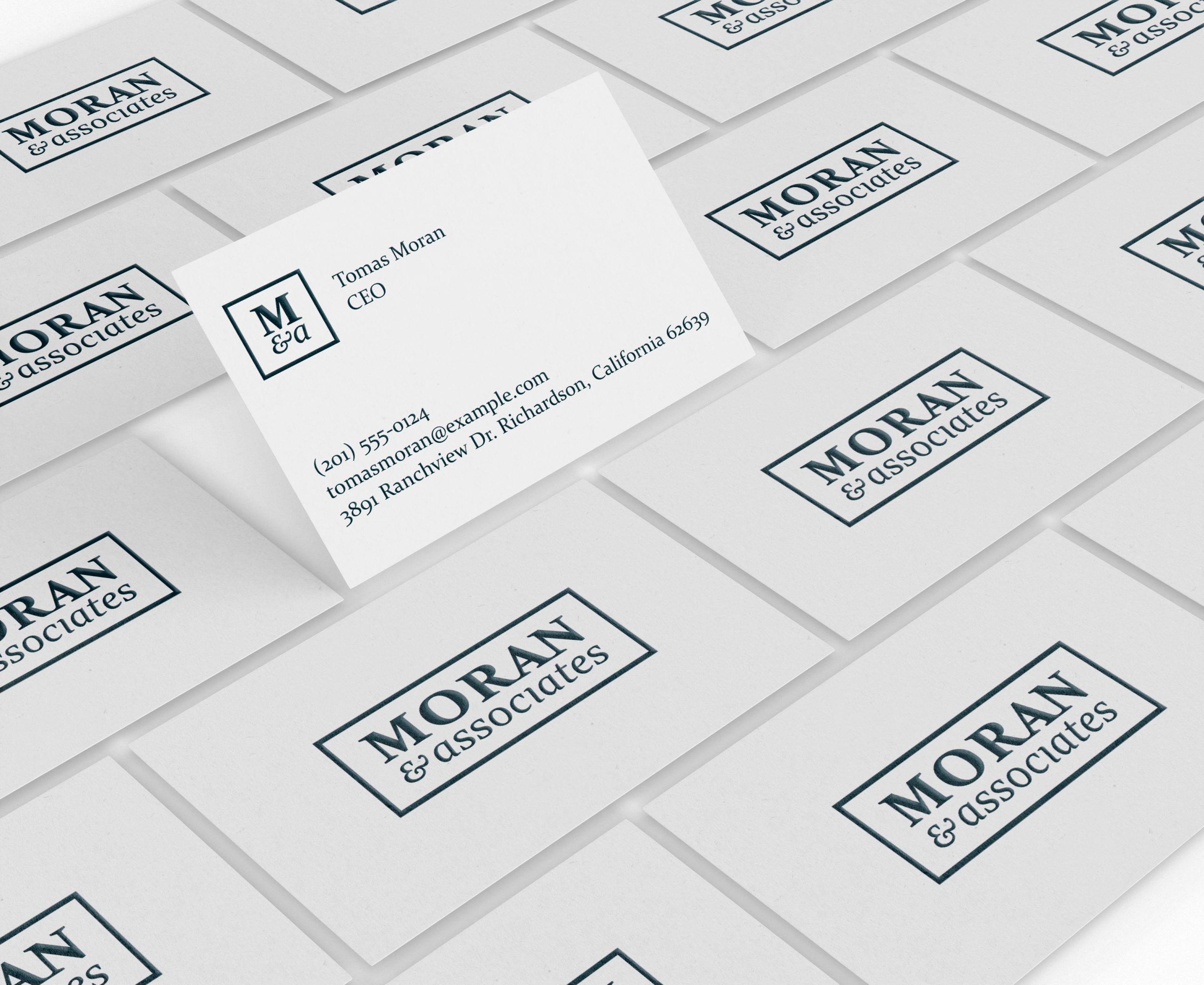
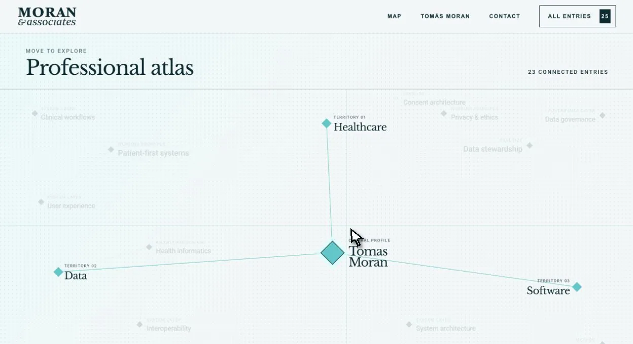
Result. A restrained but unconventional identity turned into the architecture of an interactive professional atlas, developed with AI under my direction and editable in WordPress.

Identity · Website · AI

Case 02 · Identity · Website · AI

Mahé
Pereira

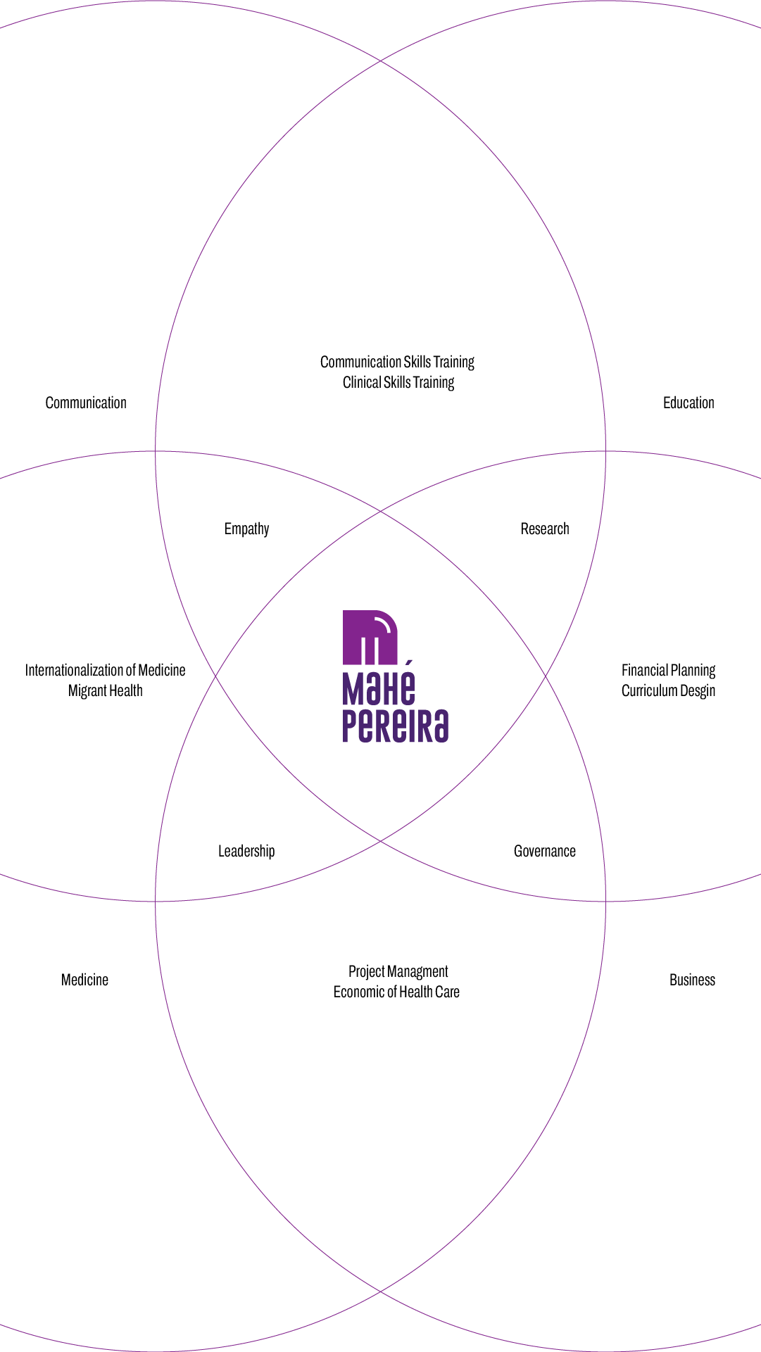
A career spanning health, education, communication, and business needed a personal identity able to organize its breadth, and a website that could let people explore it without reducing it to a single label.

Website · Walkthrough of the full experience
The challenge

Making a career that crosses different territories legible.

The brand had to present a multidisciplinary outlook without reading as a list of job titles. The goal was to build a clear, recognizable identity that could carry research, training, strategy, and communication with the same ease.

The idea

An initial turned into an open structure.

The M is distilled into a solid, geometric mark. The inner arc introduces movement, connection, and continuity: a form able to represent both strategic thinking and a career that’s always in motion.

The decisions

Violet, geometry, and a direct editorial voice.

Color adds personality without losing authority; the compact construction keeps it recognizable at small sizes, and the digital system extends the brand through space, motion, and interaction.

Result. A compact, versatile personal identity that finds, in an interactive three-dimensional map, the territory to display a complex professional experience.

Visit mahepereira.com ↗

Voices from shared projects

What’s left
after the process.

Real testimonials about the decisions, the challenges, and the experience of building something together.

Private preview · This section is only visible while you’re logged in.

“A real testimonial will appear here as soon as you approve it from Testimonials in the WordPress dashboard.”

Client namePreview

“Every published testimonial is added to this card automatically, without touching the code or the page editor.”

Client namePreview

“The carousel slides horizontally and behaves the same on desktop and mobile.”

Client namePreview

“Trabajar con Víctor para crear y definir mi marca personal fue el mayor acierto! Siempre me transmitió mucha serenidad, profesionalidad y una capacidad de escucha que me hacía sentirme muy comprendida. La comunicación siempre fue fantástica y, pese a mi sensación de estar mareándole un poco por no saber explicar bien lo que quería, siempre me hizo sentir a gusto. Además, en mi caso, yo estaba en un punto de transición laboral, de modo que mi marca debía, no solo representar a mi "yo" de entonces, sino ser una representación fehaciente de aquello en lo que me estaba convirtiendo. Aún recuerdo el día que me envió un audio diciéndome: "vengo de tomarme una cerveza y... creo que he dado con ello!" Me pareció increíble lo implicado que estaba y su gran capacidad creativa. Y efectivamente. Aún recuerdo cuando me envió el logo y me enamoré al instante. Fue una sensación de "lo has entendido todo". Además de un excelente profesional, Víctor es una maravillosa persona. Alguien en quien puedes confiar, comprometido, que va a ayudarte en todo lo que esté de su mano y que sin duda, hará el extra-mile. Gracias por todo, Víctor. Años después, sigo feliz con mi marca!”

Lidia Ruiz RevillaIdentidad de marca

“The interactive data map on my website is the first thing people praise when they see it! Victor’s knowledge of data visualization was genuinely impressive. Fast, clear, and completely custom work. I’ll definitely be working with him again on upcoming projects. If you have something niche or hard to explain, he’s the one who’ll actually get it right.”

Mahé PereiraWebsite design

01 / 03

Case 03 · Identity · Digital platform

Instituto Employer
Branding

The project needed to move away from the sector’s predictable corporate language and build a recognizable voice for training, community, consulting, and its WordPress platform.

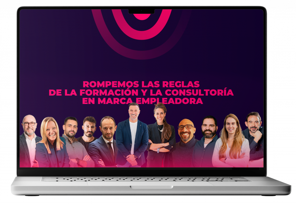
Website · Platform walkthrough
The challenge

Talking about people without reading as a generic HR brand.

It had to build authority while keeping a direct energy. The identity had to bring together content, programs, and diverse profiles without becoming a pile of disconnected pieces.

The idea

A tribe that drives change from within.

The brand is conceived as a meeting point: strong, flexible, and expressive. The system moves smoothly from bold statements to long-form training content while keeping one shared voice.

The decisions

Typography as the lead, with layouts that work like calls to action.

Type scales create rhythm, color organizes the levels of information, and pieces are built as combinable modules — so the identity keeps its character even as the content keeps changing.

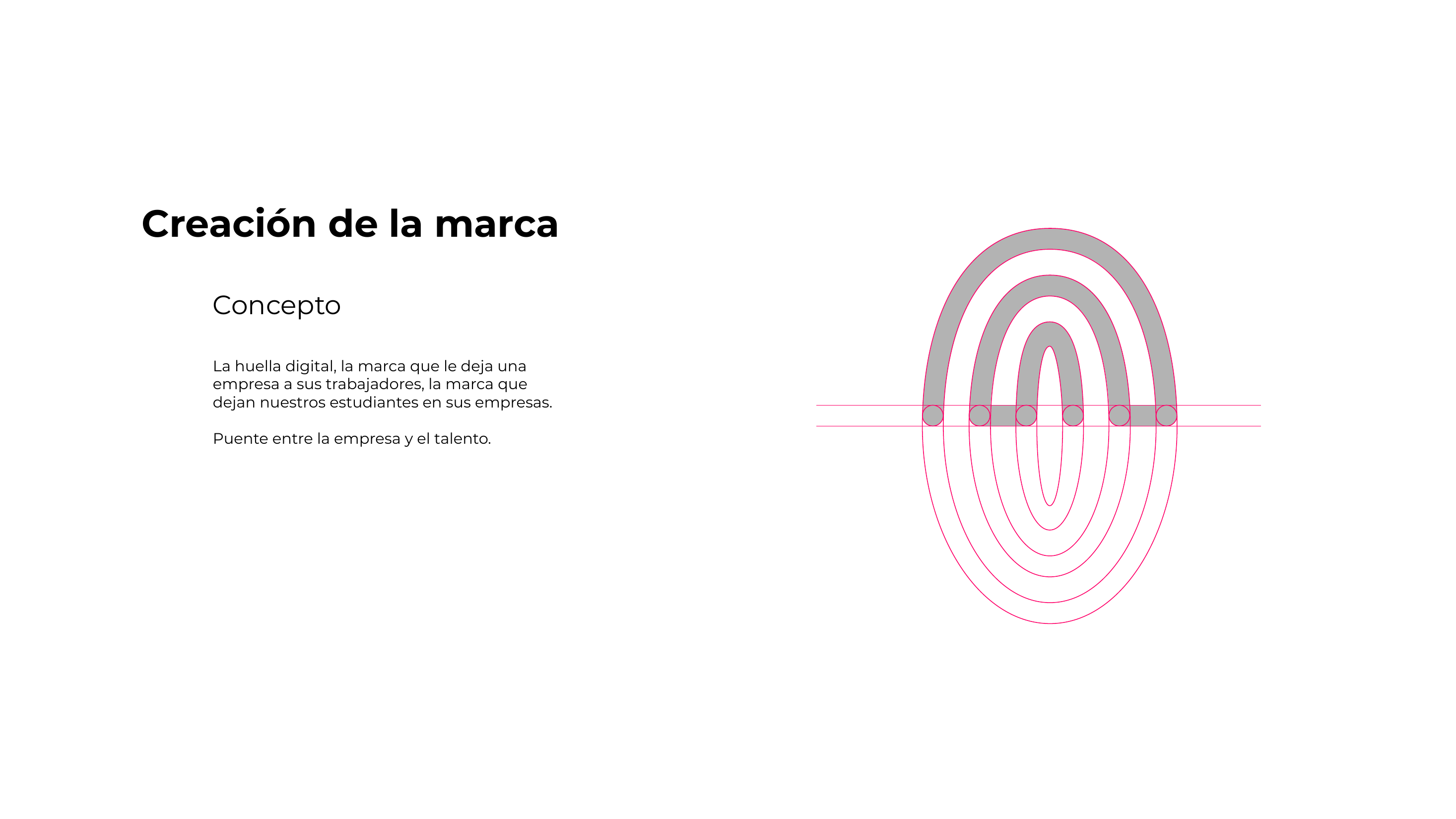
Concept and construction of the Instituto Employer Branding symbol
Concept · Mark and connection
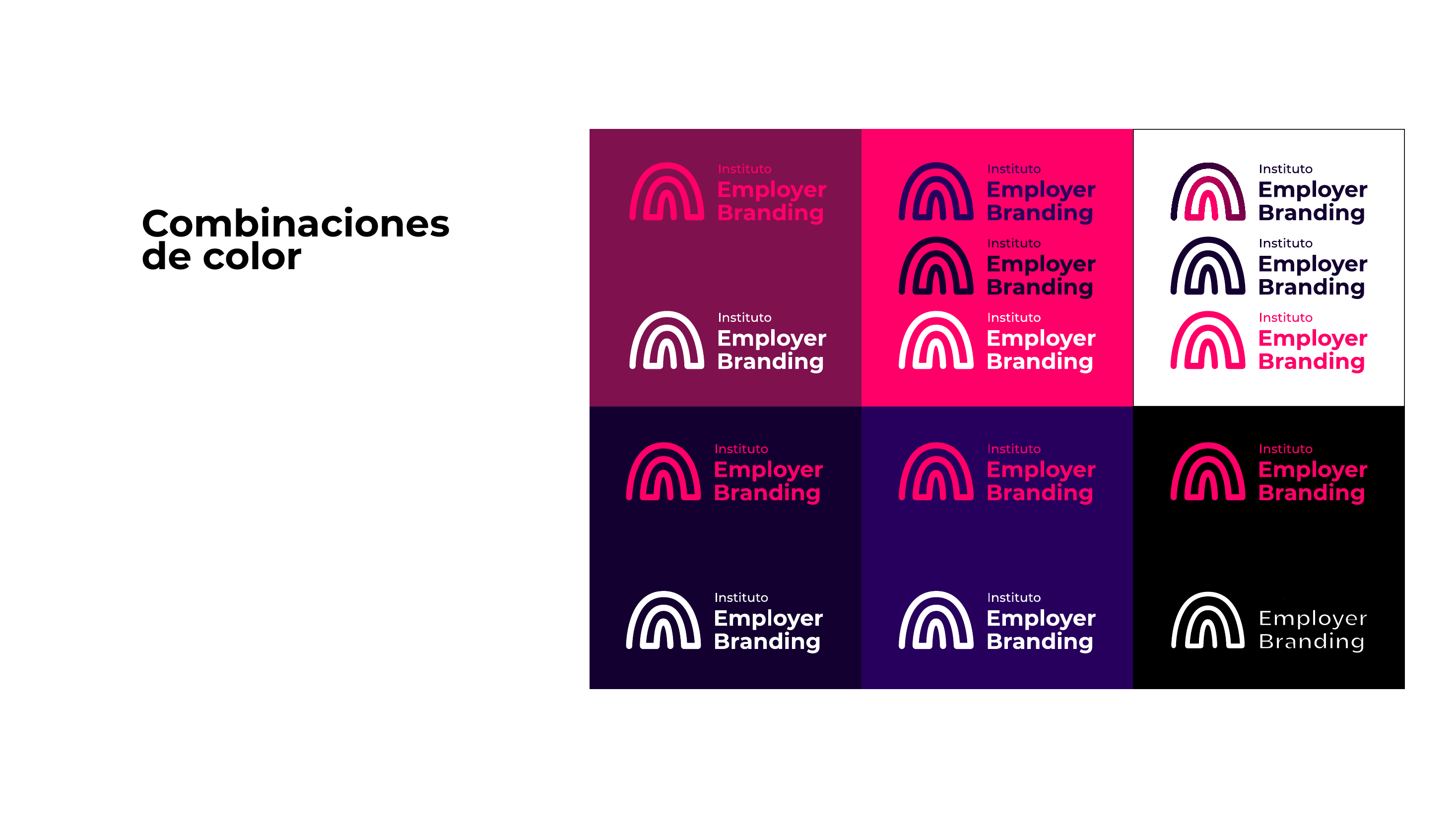
Color combinations of the Instituto Employer Branding identity
System · Color combinations

Result. An energetic, recognizable system that carries campaigns, training, community, and an editable digital platform built with AI support.

Visit the website ↗

Case 04 · Strategy and identity

Lidia
Ruiz

A personal brand needed to look professional and objective without hiding the movement, sensitivity, and warmth that define her way of working.

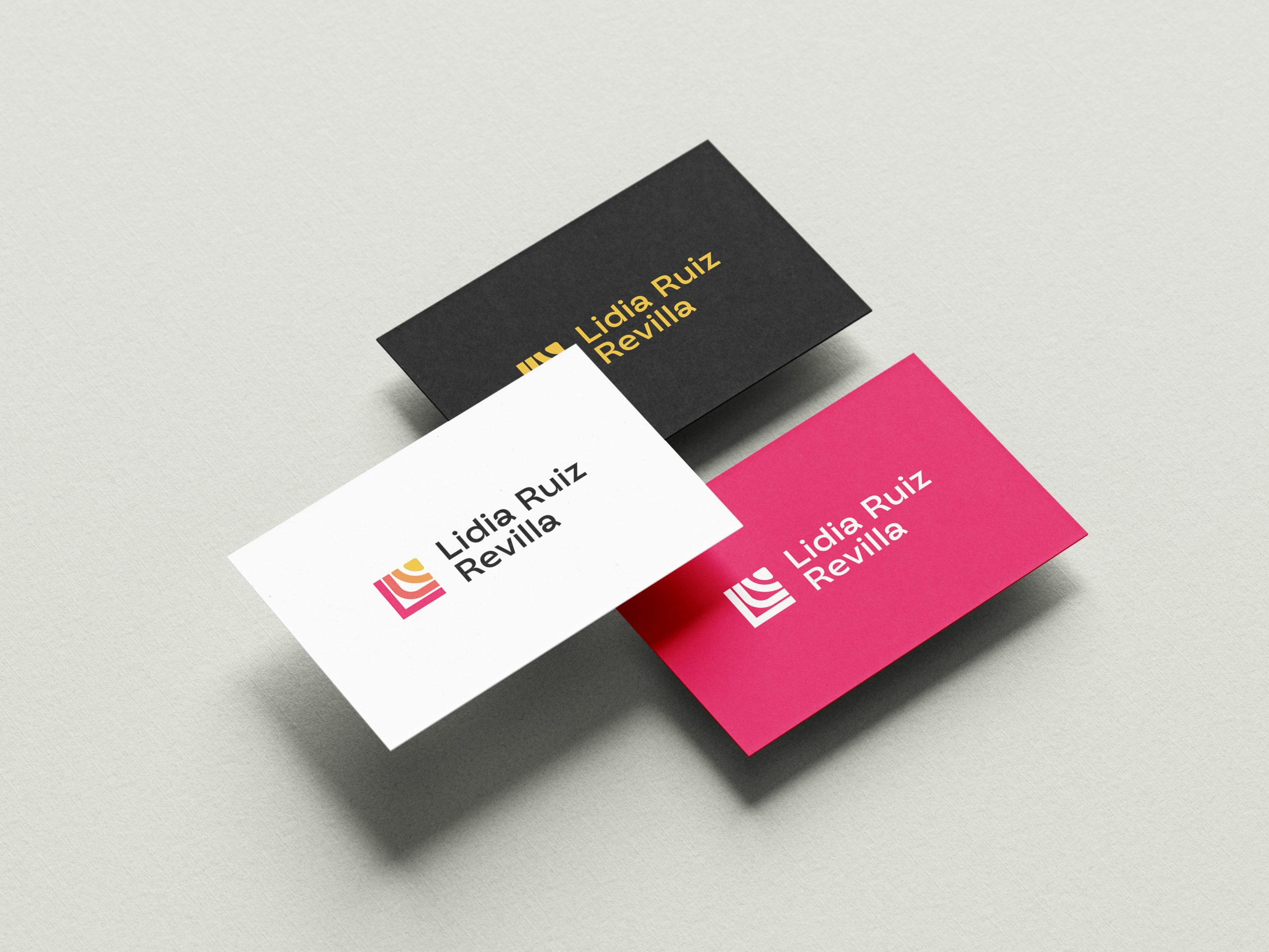
Business cards for the Lidia Ruiz Revilla identity
Applied identity · Stationery
The challenge

Balancing professional clarity with a lively personality.

The identity had to work as a personal signature, but also as a serious system for content, presentations, and new formats. The goal was to avoid both institutional stiffness and an overly casual expression.

The idea

Turning the initial into direction and movement.

The L stops being a static letter and becomes an angle, an opening, a sign of forward motion. That simple geometry makes it possible to build a recognizable identity without always relying on the full logotype.

The decisions

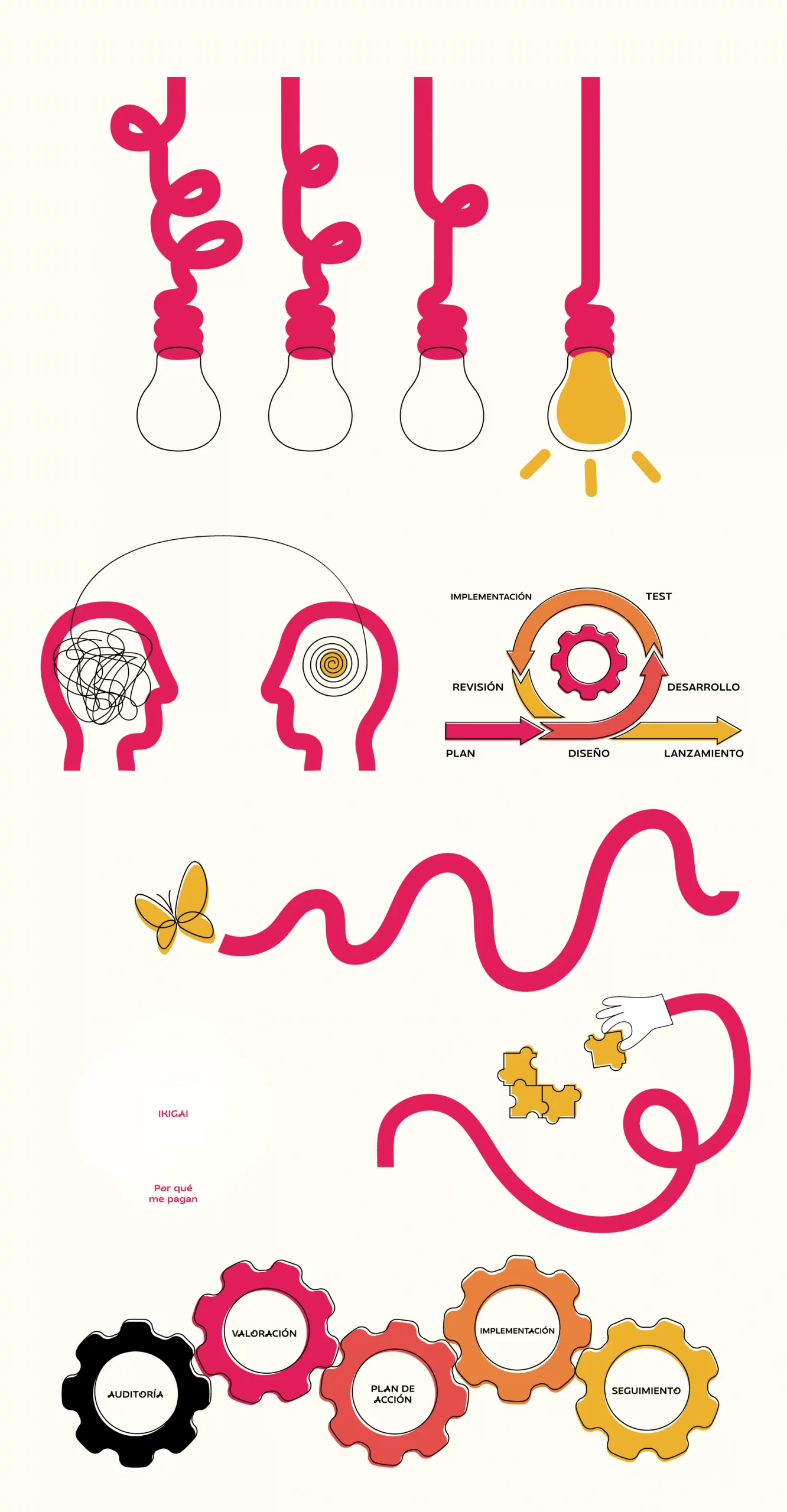
A precise foundation softened by imagery and illustration.

The angular structure brings objectivity; the white space keeps things clear, and the illustrations bring in a more human dimension. The contrast between both layers creates a voice that’s distinctive and flexible.

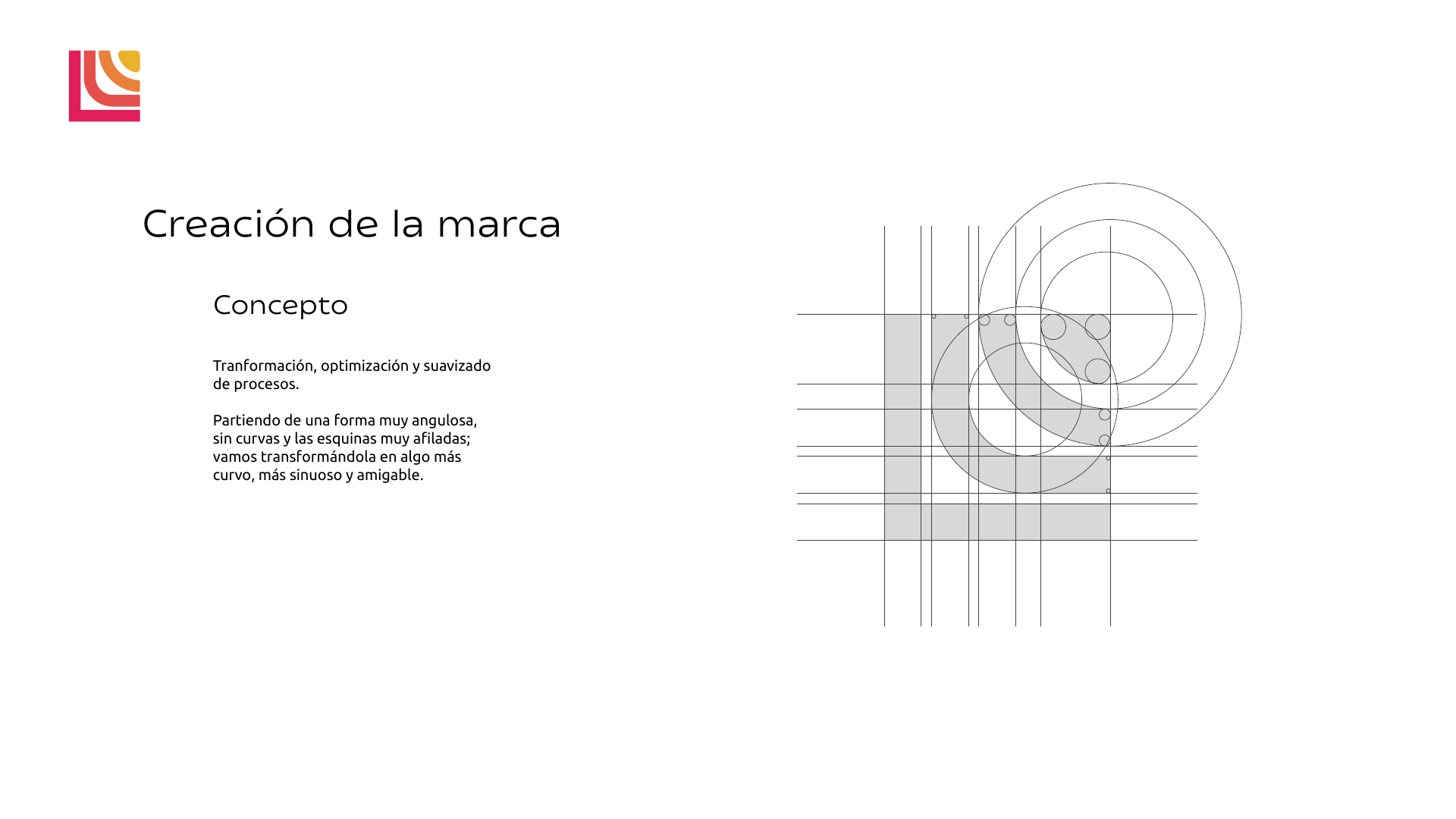
Concept and geometric construction of the Lidia Ruiz Revilla mark
Concept · Transform and simplify
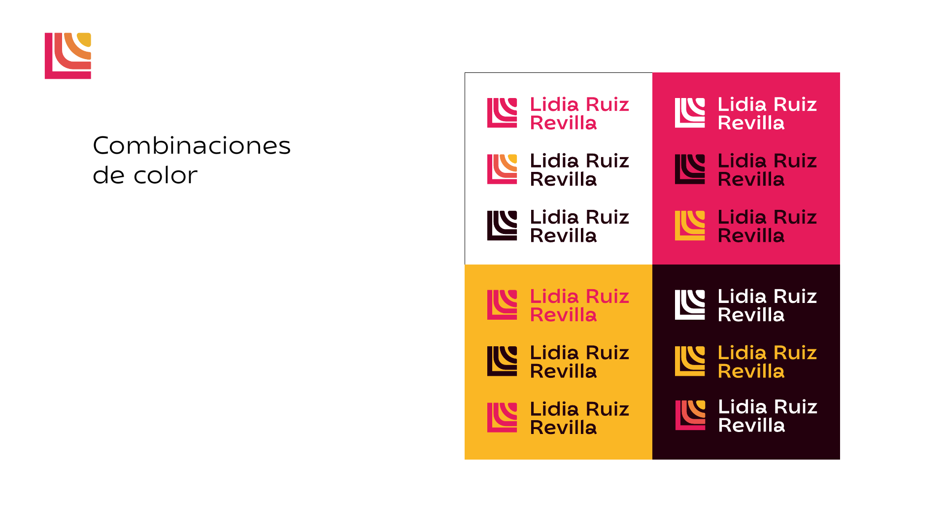
Color combinations of the Lidia Ruiz Revilla visual system
System · Color and contrast

Result. A personal brand that’s clear, expressive, and adaptable — built to grow without losing the logic that makes it recognizable.

Visual system and creative process

Case 05 · Illustration · Design · Website · AI

El
Oráculo

A digital tarot experience built as a small universe of its own: twenty-two original illustrations, full art direction, and an interactive website that turns every reading into a ritual.

Interactive experience · Tap the deck
The challenge

Turning a digital reading into an experience with presence.

Showing cards and text wasn’t enough. The page needed to create pause, anticipation, and a sense of discovery from the very first gesture, while keeping the interaction clear on both desktop and mobile.

The creation

Twenty-two illustrations to build a complete language.

Every arcana was illustrated as part of the same visual family. Color, symbols, characters, and composition work together so the cards function individually and, at the same time, form a recognizable universe.

The development

Design, motion, and code under one direction.

I designed the experience and directed the AI-assisted web development: shuffling, card selection, transitions, and the final reading all come together in an immersive journey that’s fast and accessible from any device.

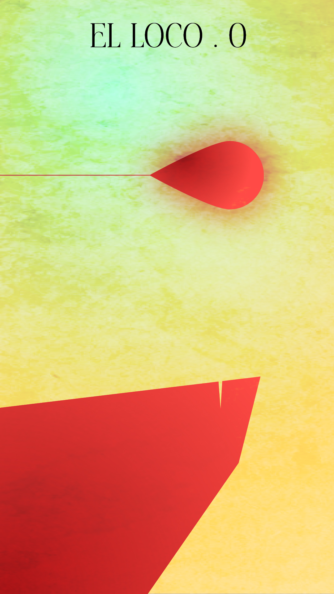
Illustration of The Fool for El Oráculo
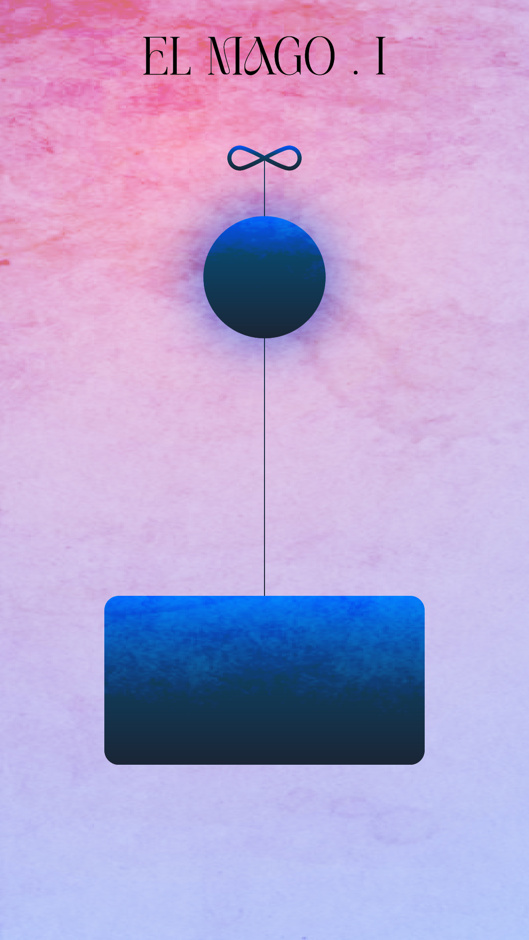
Illustration of The Magician for El Oráculo
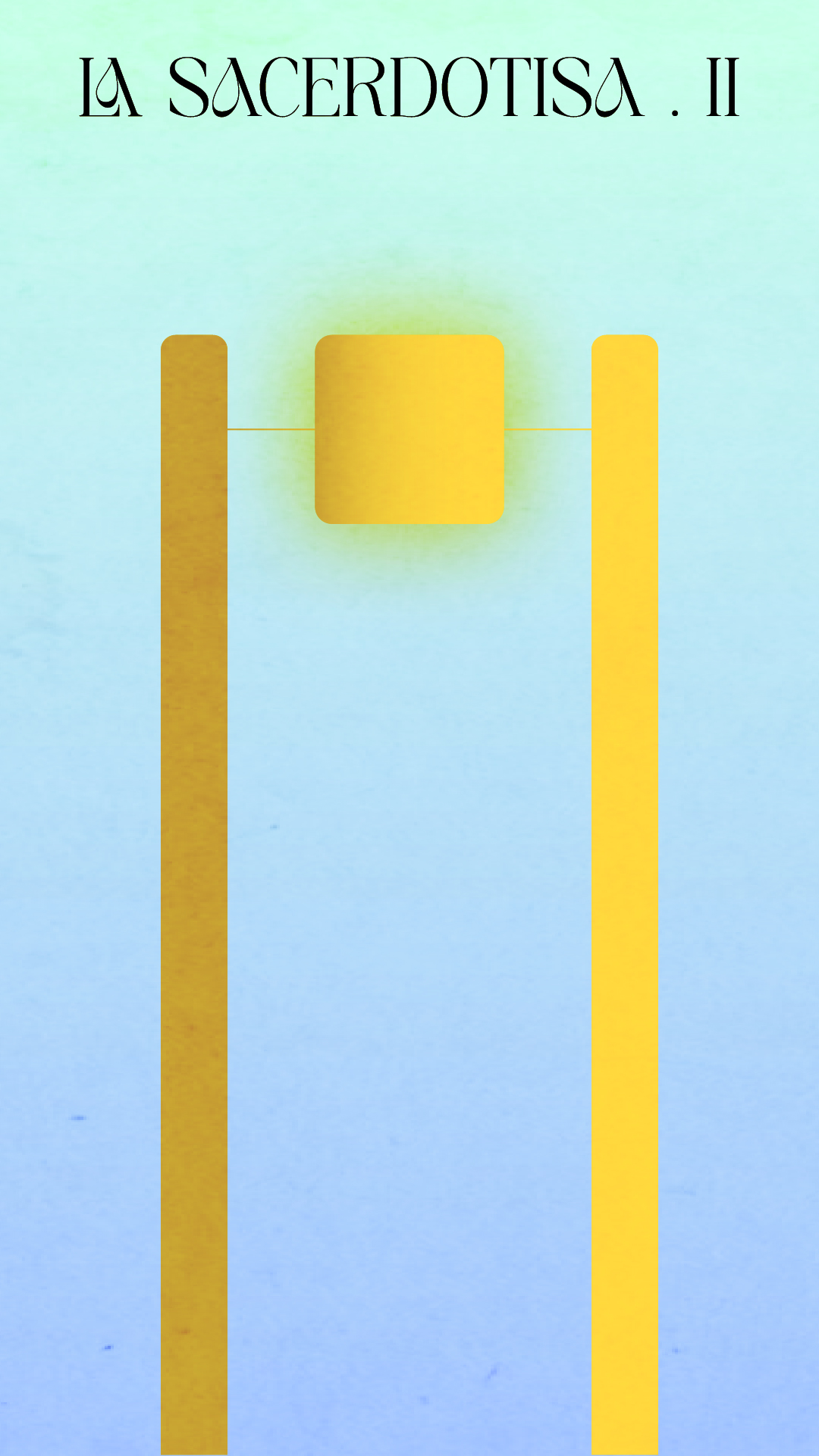
Illustration of The High Priestess for El Oráculo
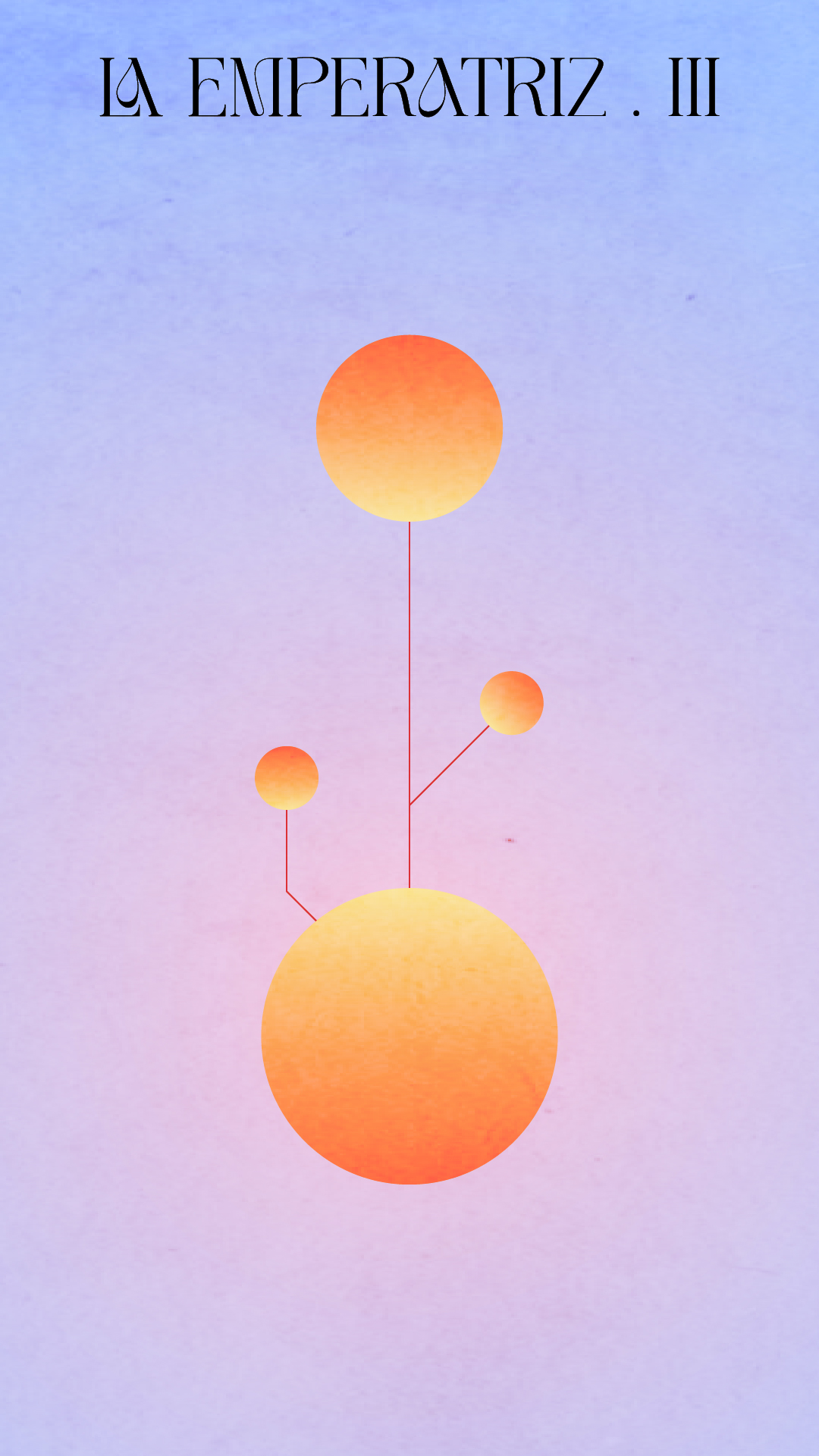
Illustration of The Empress for El Oráculo
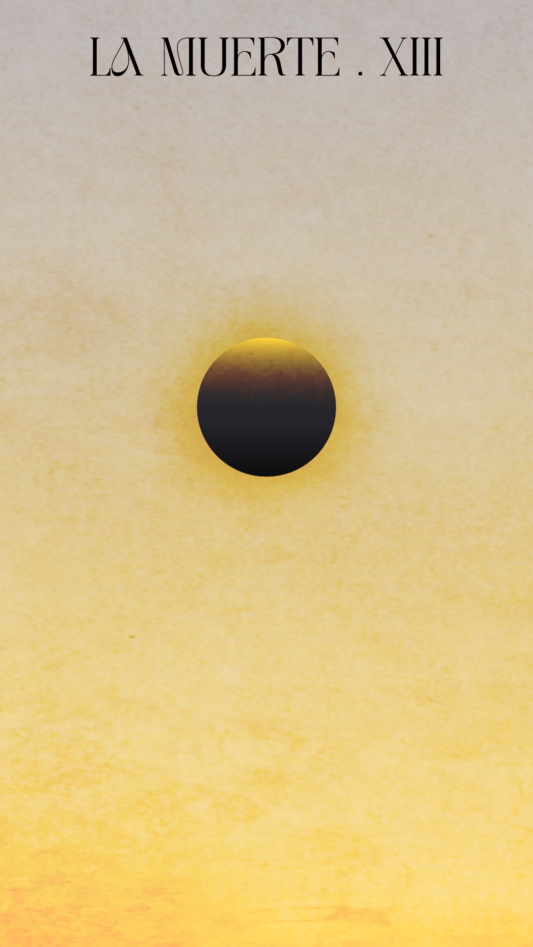
Illustration of Death for El Oráculo
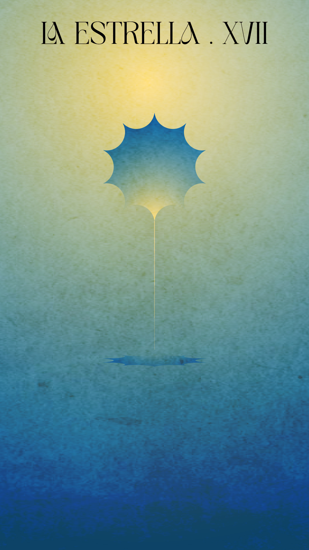
Illustration of The Star for El Oráculo
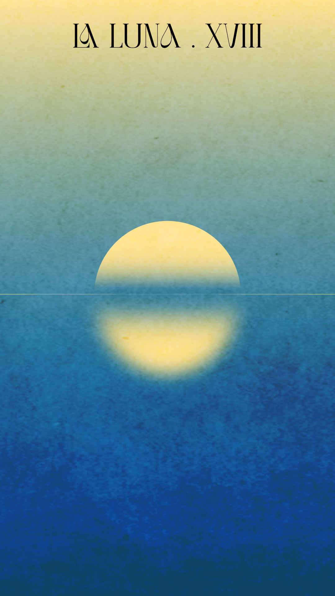
Illustration of The Moon for El Oráculo

Result. A personal project where illustration and web development meet to show how an editorial idea can become a complete digital experience.
Enter El Oráculo ↗

Other brands · Logofolio

More identities.
The same judgment.

An automatic selection of other brands developed throughout my career, outside the main case studies.

Hebra brand
Integrus brand
Kawama brand
Nature Glow brand
Un Café con Alma brand
Zinnia brand
Scroll to Top